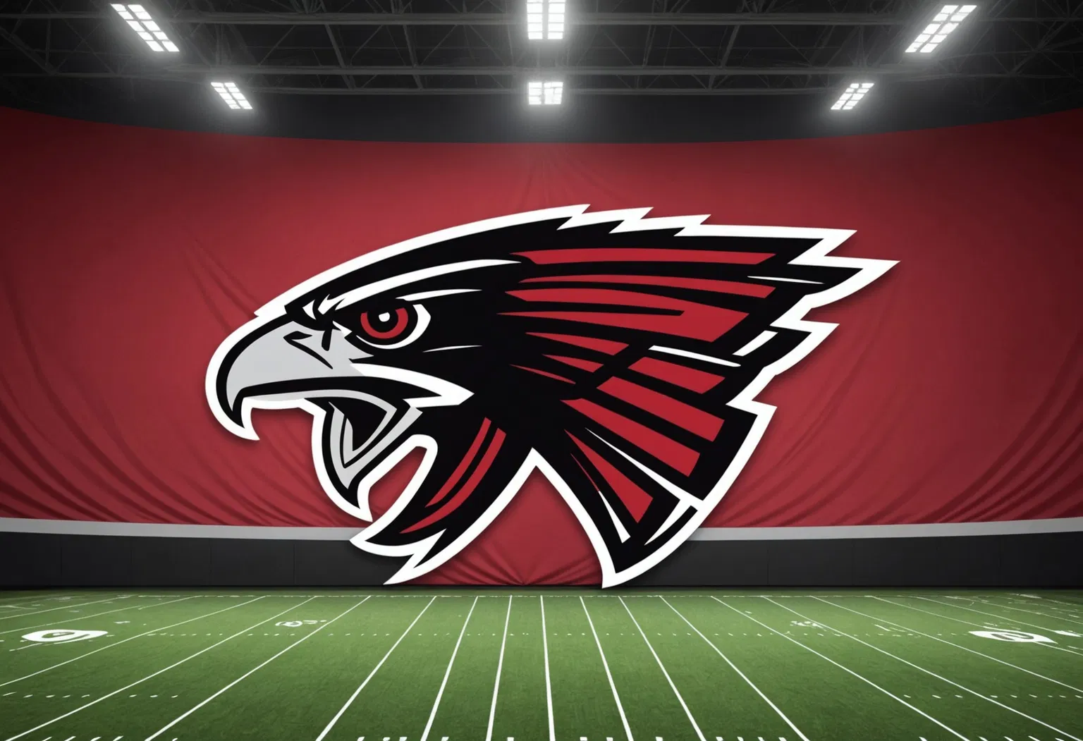
The Atlanta Falcons' "new logo" moment did not go the way the franchise intended. On Wednesday, October 21, 2026, the team swapped its X (formerly Twitter) profile picture for a graphic pairing the club's original 1966 falcon emblem with a backdrop of vertical red, white, black and gold stripes — captioned simply, "New PFP 👀." Within hours, the throwback design had ballooned into the NFL's biggest branding controversy of the season, as fans and media alike pointed out an uncomfortable resemblance to Nazi-era iconography. The episode has already forced the organization to quietly walk the image back and clarify exactly what its 2026 uniform overhaul does — and does not — include.
The graphic was never presented as an official rebrand. It was, by the team's own later account, a nod to the franchise's heritage: the original falcon mark and the iconic red helmet Atlanta wore from 1966 through 1969. But the framing — a black raptor perched dead center over a field of red, white, black and gold stripes — read very differently to the internet. Users on X immediately likened the composition to the imperial eagle and the color scheme of the Nazi flag, and the jokes spread faster than the team could respond.
Inside the Falcons' Throwback Logo That Backfired
The post arrived with a two-word caption that invited no explanation: "New PFP," short for "profile picture." The graphic featured a black version of the Falcons' classic bird set against the vertical stripes, a design the team suggested would tie into its throwback look ahead of a game in which it was expected to wear 1966-inspired uniforms against the San Francisco 49ers.
Reaction was swift and merciless. Users coined the pun "The Bird Reich," and a widely shared quip — "I did Nazi this coming" — encapsulated the tone of the response. "I must say, I was not expecting to wake up this [morning] and see the Atlanta Falcons posting what appears to be a Nazi flag," read one comment highlighted by The Guardian. Others noted the resemblance between the striped backdrop and the imagery associated with Germany's Third Reich.
For its part, the organization initially downplayed the controversy. A team representative told NBC News that the Falcons "do not have a 'new logo,'" framing the image as retro content rather than a formal brand change. But that clarification did little to slow the meme cycle, and within a couple of days the team took a more concrete step.
From "New PFP" to Backlash: How the Controversy Unfolded
The timeline is remarkably compressed — a reminder of how quickly a single social media post can spiral in the modern NFL news cycle:
- April 2, 2026: The Falcons officially unveil new primary uniforms for the 2026 season — a red home jersey and white road set featuring classic wordmarks and a black helmet, the product of a two-year collaboration with Nike.
- October 21, 2026: The team posts "New PFP 👀" on X, featuring the throwback falcon over red, white, black and gold stripes.
- October 22, 2026: Nazi comparisons and memes dominate social media; national outlets including The Guardian, The Washington Post and USA Today pick up the story.
- October 23, 2026: The Falcons quietly replace the controversial profile picture with a graphic showing a red helmet bearing the team's logo, and ESPN reports the viral stripes will appear down the center of the throwback helmets — not behind the logo as the graphic showed.
That last detail matters. Reports from ESPN and TSN clarified that the vertical stripe pattern is, in fact, part of the team's planned throwback helmet — running down the middle of the red lid rather than sitting behind the falcon. The controversy, in other words, was as much about presentation as design.
Why the Falcons' Logo Crossed a Line: The History Behind the Stripes
To understand how a marketing team walked into this, it helps to understand the branding history behind the image. The falcon mark at the center of the post is not new; it is the franchise's original logo, dating to Atlanta's inaugural 1966 season. The classic "F-bird" design — a stylized falcon forming the letter "F" — remained the team's primary emblem from 1966 through 2002, before the club unveiled its modern, more aggressive mark in 2003.
The red helmet the graphic was meant to evoke has similar roots. Atlanta wore its original red helmets from 1966 to 1969, then moved away from the look for decades. The franchise brought the 1966 throwback aesthetic back into rotation in 2009, and in 2022 it reintroduced the red helmet for select throwback games — a fan-favorite nod to the franchise's earliest era.
That context explains the intent. The problem was the execution. By placing the black falcon directly over red, white and black stripes — colors that, combined with the rigid vertical pattern, evoke the flags and imagery of Nazi Germany — the Falcons produced a graphic that read as an accidental reference to one of history's most reviled regimes. It was, in the view of many commentators, a self-inflicted branding error: a heritage tribute that needed only a different background to avoid the comparison entirely.
Where Things Stand: Falcons Replace Controversial Image
As of Friday, October 23, the throwback graphic is gone from the Falcons' X profile. In its place sits an image of the red helmet bearing the team's logo — a subtle but unmistakable acknowledgment that the original post had missed the mark. The organization has not issued a formal apology, and it reportedly declined official comment on the matter, but the visual correction spoke for itself.
Meanwhile, the design elements at the heart of the story live on in a different form. ESPN reported that the viral stripes will appear down the center of the team's throwback helmets, a detail confirmed by TSN, which noted the stripes run down the middle of the red helmet rather than behind the logo as the controversial graphic showed. The throwback uniforms themselves — including the beloved red helmet — remain on track as part of Atlanta's 2026 celebration of its history.
What's Next for the Falcons' Branding and Throwback Uniforms
The immediate focus shifts back to the field, where the Falcons take the field Sunday wearing a throwback logo on their helmets — but, as Yahoo Sports reported, not the design that went viral. The red helmets and retro uniforms remain staples of the team's identity, and the franchise has made clear it intends to keep that cherished look in rotation as a special, limited-use uniform.
Longer term, the episode raises a familiar question for NFL teams investing heavily in nostalgia-driven branding: how do you celebrate history without stumbling into imagery that carries painful historical weight? The Falcons' 2026 redesign — red home jerseys replacing the black tops worn since 2020, classic wordmarks, and a sharpened nod to the 1966 era — was widely praised in April. One botched social graphic has now become the headline many fans will remember first.
The Bottom Line: Key Points to Remember
- The Falcons posted a throwback logo over red, white, black and gold stripes on October 21, 2026, captioned "New PFP 👀."
- The image drew immediate comparisons to Nazi-era imagery, sparking memes like "The Bird Reich" and "I did Nazi this coming."
- The team told NBC News it has no "new logo," framing the image as retro content.
- By October 23, the Falcons had quietly replaced the graphic with a red helmet image.
- ESPN and TSN reported the stripes will run down the center of the throwback helmets, not behind the logo.
- The imagery ties to Atlanta's original 1966 falcon mark and the red helmets worn from 1966 to 1969.